
聊天模块
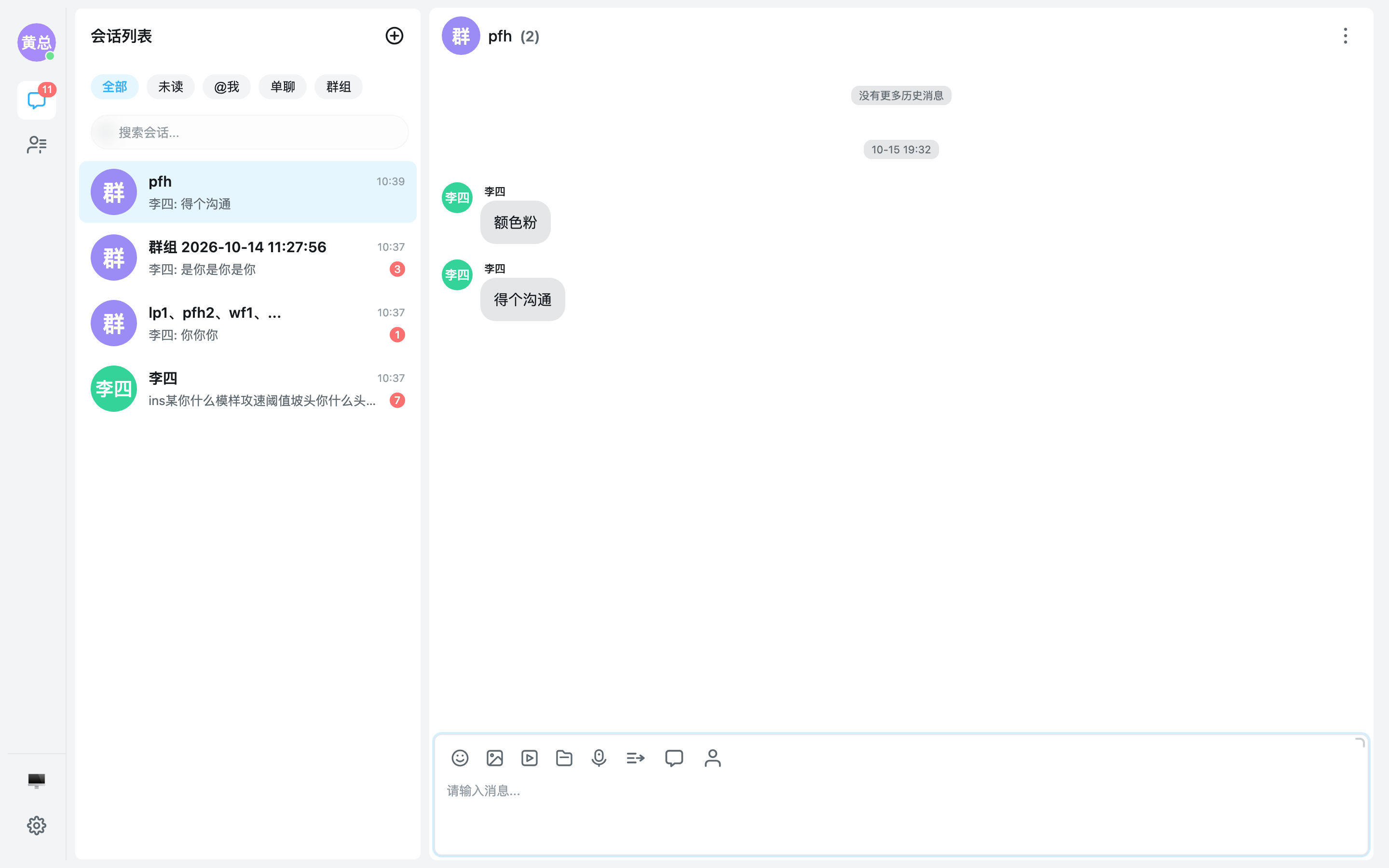
聊天容器,提供完整的会话聊天页:消息列表(虚拟滚动)、输入区(文本 / 表情 / 图片 / 文件 / 语音)、消息操作(引用、复制、撤回、翻译、多选转发)与群组相关能力,数据由 Provider 统一管理。
使用方式
组件以 EmChatContainer 为名导出。需与 EmConversationContainer 配合 EmUIKitProvider 使用:
<script setup lang="ts">
import { EmUIKitProvider } from '@easemob-community/uikit-im'
</script>

<template>
  <EmUIKitProvider
    app-key="your-app-key"
    :auto-init="true"
  >
    <div style="display: flex; height: 100vh;">
      <div style="width: 320px; flex-shrink: 0;">
        <em-conversation-container />
      </div>
      <div style="flex: 1;">
        <em-chat-container />
      </div>
    </div>
  </EmUIKitProvider>
</template>
聊天容器会跟随
useConversation()中的当前会话自动切换:点击左侧会话列表(conversation-select)后,聊天页即开始加载对应会话的消息。
复合消息(图文混排)
multi_body 把 2~20 个有序内容段作为一条消息发送。与 combine 的多条历史消息合并转发不同,复合消息只有一个消息 ID 和一套发送状态。
const chatConfig = {
  input: {
    mode: 'rich', // rich:inline 图文;simple:文字 + 底部附件区
    features: {
      multiBody: true,
    },
  },
}- PC rich:图片、视频和文件都在光标处内联,可继续编辑前后文字;图片等比缩小,视频/文件显示附件卡片,发送顺序与文档顺序一致。
- PC simple:图片、视频和文件在文字下方的待发送区预览,可删除后继续编辑并一次发送。
- 复合草稿:开启草稿后,simple/rich 在页面内切换会话会保留文字、图片、视频、文件、@提及及内容顺序;会话列表按顺序显示
[图片]文字等摘要,只有附件时也会保留草稿。 - 发送判定:单附件无文字仍发普通消息;文字 + 附件或两个及以上附件发一条
multi_body,最多 20 段。 - H5:不提供复合编辑/发送入口,附件仍分开发送;可接收展示复合消息并逐段下载附件。
- 其他分段:语音、位置和 custom 可通过
useChat().sendMultiBodyMessage发送,七类分段均可接收展示。 - 能力限制:默认关闭,还需 adapter 上报
multiBodyMessage !== false;websdk4 完全不支持。复合消息不可编辑或翻译。
完整发送示例见 useMessageSend,单条渲染见 MultiBodyMessage。
顶部横幅显示控制
messageList.pinnedBar.visible 和 messageList.groupAnnouncementBar.visible 分别控制顶部置顶消息与群公告横幅,默认均为 true,可独立配置:
<EmChatContainer
  :config="{
    messageList: {
      pinnedBar: { visible: false },
      groupAnnouncementBar: { visible: false },
    },
  }"
/>
传入响应式配置即可在运行时动态切换:
<script setup lang="ts">
import { reactive } from 'vue'
import { EmChatContainer } from '@easemob-community/uikit-im'
import type { ChatConfig } from '@easemob-community/uikit-im'

const chatConfig = reactive<ChatConfig>({
  messageList: {
    pinnedBar: { visible: true },
    groupAnnouncementBar: { visible: true },
  },
})

function togglePinnedBar() {
  const config = chatConfig.messageList?.pinnedBar
  if (config)
    config.visible = !config.visible
}

function toggleGroupAnnouncementBar() {
  const config = chatConfig.messageList?.groupAnnouncementBar
  if (config)
    config.visible = !config.visible
}
</script>

<template>
  <button type="button" @click="togglePinnedBar">切换置顶消息横幅</button>
  <button type="button" @click="toggleGroupAnnouncementBar">切换群公告横幅</button>
  <EmChatContainer :config="chatConfig" />
</template>
这些开关仅控制顶部横幅:置顶/取消置顶操作仍由 messageAction.enablePin 控制;隐藏群公告横幅不会停止公告预拉,也不影响会话详情抽屉中的公告查看与编辑。
API
ChatContainer API
Props
| 属性 | 类型 | 默认值 | 说明 |
|---|---|---|---|
| config | ChatConfig | — | 聊天容器完整配置(输入框 / 消息列表 / 消息操作 / 群能力等,见 ChatConfig) |
| loading | boolean | — | 是否处于全局加载状态 |
| class | string | — | 自定义根元素 class |
| style | Record<string, string> | — | 自定义根元素 style |
config
聊天页面全局配置
| 属性 | 类型 | 默认值 | 说明 |
|---|---|---|---|
| enableDraft | boolean | — | 是否启用草稿功能(切换会话时自动保存/恢复输入内容),默认 true;PC 复合模式在页面内保留图文/视频/文件快照 / Whether drafts are saved and restored on conversation switch; PC multi-body drafts retain attachments for the page lifetime |
| hooks | ChatSendHooks | — | 消息发送拦截钩子 |
| header | Header 配置 | — | Header 配置 |
| drawer | 抽屉配置 / Drawer configuration | — | 抽屉配置 / Drawer configuration |
| messageList | 消息列表配置 | — | 消息列表配置 |
| messageAction | 消息操作配置 | — | 消息操作配置 |
| groupReadReceipt | 群已读回执配置 | — | 群已读回执配置 |
| groupMember | 群成员列表配置 | — | 群成员列表配置 |
| groupManagement | 群管理功能配置 | — | 群管理功能配置 |
| input | 输入框配置 | — | 输入框配置 |
| lastMessageTextResolver | LastMessageTextResolver | — | 会话列表最新一条消息文案解析器;custom 消息等场景可由业务自定义预览内容 |
| textMessage | 文本消息配置 | — | 文本消息配置 |
config.hooks
消息发送拦截钩子
| 属性 | 类型 | 默认值 | 说明 |
|---|---|---|---|
| beforeSend | (message: Partial<UiMessage>) => boolean | Promise<boolean> | — | 发送前拦截,返回 false 则阻止发送 |
| afterSend | (message: UiMessage) => void | — | 发送成功后的回调 |
config.header
Header 配置
| 属性 | 类型 | 默认值 | 说明 |
|---|---|---|---|
| visible | boolean | — | 是否显示 header,默认 true |
| align | HeaderAlign | — | 标题对齐方式,默认 'center';对单聊/群聊同时生效 |
| showAvatar | boolean | — | 是否显示头像,默认 false |
| showMemberCount | boolean | — | 是否显示群成员数后缀,默认 true;仅群聊生效 |
| showDrawerEntry | boolean | — | 是否显示抽屉入口按钮(聊天信息),默认 true |
| clickOpenDrawer | boolean | — | 点击 header(标题/副标题区域)是否展开会话详情抽屉,默认 true; 头像(名片弹窗)与右侧按钮(搜索/抽屉入口)的点击不受影响。 Whether clicking the header (title/subtitle area) opens the conversation-details drawer. Default true. Avatar (profile card) and action buttons are not affected. |
| showSearchEntry | boolean | — | 是否显示 header 搜索消息按钮,默认 false(搜索入口归口会话详情抽屉的 Message Search 行; 仅在 messageList.search.enabled 为 true 时生效,开启后 header 恢复显示搜索按钮)。 Whether to show the message-search button in the header. Default false — the search entry lives in the conversation-details drawer; takes effect only when message search is enabled. |
| subtitle | 'auto' | 'presence' | 'sign' | 'none' | — | 单聊副标题档位(标题下方区域),默认 'auto';仅单聊生效: auto(在线状态 + 个性签名,缺哪个显示哪个)/ presence(仅在线状态)/ sign(仅签名)/ none(整个副标题区连同「正在输入」提示一起关闭)。 对方正在输入时优先占据此区域;可被 #header-subtitle 插槽整体接管。 Subtitle level under the title for single chats. Default 'auto'. |
config.drawer
抽屉配置 / Drawer configuration
| 属性 | 类型 | 默认值 | 说明 |
|---|---|---|---|
| mode | 'overlay' | 'push' | — | 展示模式,默认 'push':'push' 占位挤压聊天区,抽屉以独立平面区域参与布局 (圆角跟随 --uikit-components-radius);'overlay' 完全遮挡聊天区。 移动端(viewport < 768)两种模式一律回落为满铺全屏(独立页面观感)。 Display mode. Default 'push' (takes layout space and squeezes the chat area as an independent flat region); 'overlay' covers the chat area. On mobile (<768px) both fall back to fullscreen. |
| width | number | — | 抽屉宽度(px),默认 320;push 与 overlay 模式均生效,全屏模式忽略 / Drawer width in px. Default 320; ignored in fullscreen |
| closeOnClickOutside | boolean | — | 是否点击抽屉外部(聊天区 / 其他空白处)自动关闭,默认 true;仅 push 模式生效 (overlay 模式由遮罩点击关闭,语义归口 closeOnClickOverlay),全屏模式忽略。 Whether clicking outside the drawer (chat area / blank areas) closes it. Default true; only applies in 'push' mode (overlay mode closes via the mask click), ignored in fullscreen. |
| avatarClickViewProfile | boolean | — | 抽屉预览区点击头像是否打开用户名片(单聊对方头像 / 群聊成员宫格头像),默认 true; 关闭后群聊宫格头像点击回落为「查看全部成员」。 Whether clicking an avatar in the drawer preview area (peer avatar in single chats, member grid avatars in group chats) opens the user profile card. Default true; when false, group grid avatar clicks fall back to "view all members". |
config.messageList
消息列表配置
| 属性 | 类型 | 默认值 | 说明 |
|---|---|---|---|
| layout | MessageLayout | — | 消息布局模式,默认 'conversation' |
| showAvatar | boolean | — | 是否显示头像(自己与对方的统一开关),默认 true |
| showSelfAvatar | boolean | — | 是否显示「自己」的头像,默认 true;仅在 showAvatar 为 true 时生效。 设为 false 可隐藏自己的头像而对方头像照常显示(微信/QQ 式「隐藏我的头像」)。 |
| showTime | TimeDisplayStrategy | — | 时间显示策略,默认 false(不显示),可设置为 true / 'always' / 'hover' |
| bubbleShape | BubbleShape | — | 气泡形状(圆角档位:'round' = 16px / 'square' = 8px),默认 'round' / Bubble corner preset, default 'round' (16px); 'square' is 8px |
| bubbleStyle | 'filled' | 'plain' | — | 中性气泡(对方)样式:'filled' 带底色(默认)/ 'plain' 无底色纯文字。 Neutral bubble (peer side) style: 'filled' with background (default) or 'plain' text-only without background. |
| voiceUnreadDot | boolean | — | 对方语音消息未播放红点:默认 true(本会话实时收到的语音未点击时,气泡外侧垂直居中显示红点,点击后隐藏; 历史/漫游消息无播放状态,永不显示,刷新页面即复位)。 单条消息级覆盖:在消息项插槽(如 #message-voice)内对 INJECTION_KEY.VOICE_UNREAD_DOT 深一层 provide。 Whether to show an unread red dot on peer voice messages (default true; runtime-only, resets on refresh). Per-message override: provide INJECTION_KEY.VOICE_UNREAD_DOT one level deeper inside item slots. |
| avatarSize | number | — | 头像尺寸(px),默认 36 |
| presence | boolean | — | 消息头像在线状态点:默认 false(不展示;微信/QQ 式消息流头像不带状态点)。 开启后仅对方头像展示状态点,且需 Provider 全局 enablePresence 链路可用。 Whether to show presence dots on message avatars. Default false; only peer avatars show the dot, gated by the global enablePresence feature. |
| avatarClickViewProfile | boolean | — | 左键点击消息头像是否打开用户名片,默认 true;右键菜单(查看资料/@提及)不受此开关影响 |
| messageGap | number | — | 消息项之间的间距(px),默认 12 |
| messagePadding | number | — | 消息列表内边距(px),默认 16 |
| groupInterval | number | — | 时间分组间隔(毫秒),默认 5 分钟 |
| virtualScrollThreshold | number | — | 虚拟滚动阈值,超过该消息数启用虚拟滚动,默认 100 |
| loadHistory | 加载历史消息配置 | — | 加载历史消息配置 |
| maxMessageCount | number | — | 单个会话最大消息存储数,超出时从旧消息开始裁剪,默认 300 |
| pinnedBar | 置顶横幅配置 | — | 置顶横幅配置 |
| groupAnnouncementBar | 群公告横幅配置 / Group announcement banner configuration | — | 群公告横幅配置 / Group announcement banner configuration |
| search | 消息搜索配置(居中 Modal 形态,支持关键词高亮与消息类型筛选) | — | 消息搜索配置(居中 Modal 形态,支持关键词高亮与消息类型筛选) |
| autoLocateAtMe | boolean | — | 切换会话时是否自动定位到首条@我的消息,默认 true |
| messageStatus | MessageStatusConfig | — | 消息发送状态展示配置 |
| quote | 引用展示配置 | — | 引用展示配置 |
config.messageList.loadHistory
加载历史消息配置
| 属性 | 类型 | 默认值 | 说明 |
|---|---|---|---|
| enable | boolean | — | 是否启用历史消息加载,默认 true |
| mode | LoadHistoryMode | — | 加载模式,默认 'auto'(自动适配端型) |
config.messageList.pinnedBar
置顶横幅配置
| 属性 | 类型 | 默认值 | 说明 |
|---|---|---|---|
| visible | boolean | — | 是否显示顶部置顶条,默认 true |
| maxPreviewLength | number | — | 预览文本最大长度,默认 30 |
config.messageList.groupAnnouncementBar
群公告横幅配置 / Group announcement banner configuration
| 属性 | 类型 | 默认值 | 说明 |
|---|---|---|---|
| visible | boolean | — | 是否显示聊天页顶部群公告横幅,默认 true;不影响抽屉中的群公告 / Whether to show the announcement banner at the top of the chat page. Default true; does not affect the drawer announcement |
config.messageList.search
消息搜索配置(居中 Modal 形态,支持关键词高亮与消息类型筛选)
| 属性 | 类型 | 默认值 | 说明 |
|---|---|---|---|
| enabled | boolean | — | 是否启用消息搜索入口,默认 false |
| enableServerSearch | boolean | — | 是否启用 SDK 服务端消息搜索(websdk2 searchMessages),默认 false(仅搜索本地已加载消息);开启后出现「当前会话/全部会话」作用域切换 |
| pageSize | number | — | 每页条数,默认 20 |
config.messageList.messageStatus
消息状态展示配置
| 属性 | 类型 | 默认值 | 说明 |
|---|---|---|---|
| showText | boolean | — | 是否显示状态文本,默认 false(仅展示 icon) |
| textMap | Partial<Record<MessageStatusValue, string>> | — | 状态文本映射,未指定时从 locale 读取默认文案 |
| iconMap | Partial<Record<MessageStatusValue, string>> | — | 状态图标映射,未指定时使用默认图标 |
| direction | 'horizontal' | 'vertical' | — | 文本与图标的排列方向,默认 'horizontal' |
| position | 'below' | 'inline' | — | 状态相对消息气泡的位置,默认 'inline'(气泡末尾、与气泡底部对齐);'below' 为气泡下方 / Position relative to the bubble, default 'inline' (at bubble end, bottom-aligned) |
| style | MessageStatusStyle | — | 消息状态图标风格。 - classic(默认):沿用 check / doneAll 经典双勾映射; - capsule:数字胶囊风格,未读=空心圆/实心圆点,已读=圆+对勾。 |
| readIconDisplay | 'latest' | 'all' | — | 单聊己方「已读」状态图标的展示策略,默认 'latest';仅单聊生效。 - latest:连续已读只在最新一条已读消息上展示已读 icon(仿抖音移动端); - all:每条已读消息都展示已读 icon。 Display strategy for the read icon on self messages in single chats. Default 'latest'. |
config.messageList.quote
引用展示配置
| 属性 | 类型 | 默认值 | 说明 |
|---|---|---|---|
| showAvatar | boolean | — | 引用卡片是否展示原消息发送人头像,默认 false。 Whether the quote card shows the original sender's avatar. Default false. |
config.messageAction
消息操作配置
| 属性 | 类型 | 默认值 | 说明 |
|---|---|---|---|
| enableQuote | boolean | — | 启用引用,默认 true |
| enableCopy | boolean | — | 启用复制,默认 true(文本消息与含文本段的复合消息生效) |
| enableDownload | boolean | — | 启用下载,默认 true(仅文件消息生效) |
| enableDelete | boolean | — | 启用删除,默认 true |
| enableRecall | boolean | — | 启用撤回,默认 true |
| enableRecallOther | boolean | — | 启用撤回他人消息,默认 true(仅群主/管理员在群聊中生效) |
| enableEdit | boolean | — | 启用编辑,默认 true(仅 isSelf 且文本消息生效) |
| enableForward | boolean | — | 启用转发,默认 true |
| enableMultiSelect | boolean | — | 启用多选,默认 true |
| enableTranslate | boolean | — | 启用翻译,默认 true(仅文本消息生效) |
| enableVoiceToText | boolean | — | 启用语音转文字,默认 true(仅带 url 的语音消息生效) |
| enablePin | boolean | — | 启用置顶/取消置顶,默认 true |
| recallDisableDuration | number | — | 撤回禁用时长(毫秒),超过该时长后无法撤回,默认 2 分钟(120000) |
| translateTargetLang | string | — | 翻译目标语言,例如 'zh-Hans'、'en'。不设置时根据 UIKIT 当前 locale 自动选择(zh-CN→zh-Hans,en→en,其他默认 en) |
| gridActionTypes | MessageActionType[] | — | H5 长按操作面板(ActionSheet)的高频操作集合:命中的操作类型收拢到顶部图标网格区, 其余保持整行列表;默认 ['quote', 'copy', 'forward', 'download']。传 [] 关闭网格分区。 |
config.groupReadReceipt
群已读回执配置
| 属性 | 类型 | 默认值 | 说明 |
|---|---|---|---|
| enabled | boolean | — | 是否启用群已读回执,默认 false |
| maxGroupSize | number | — | 群人数上限,默认 200(超过此人数不发已读回执) |
config.groupMember
群成员列表配置
| 属性 | 类型 | 默认值 | 说明 |
|---|---|---|---|
| allowChat | 'all' | 'contact' | 'none' | — | 是否允许对成员发起单聊,默认 'all' |
config.groupManagement
群管理功能配置
| 属性 | 类型 | 默认值 | 说明 |
|---|---|---|---|
| displayMode | 'drawer' | 'modal' | — | 二级页面展示方式:drawer(抽屉)或 modal(居中弹窗),默认 drawer |
| showMuteAll | boolean | — | 是否展示全员禁言开关,默认 true |
| showMuteList | boolean | — | 是否展示禁言列表入口,默认 true |
| showBlocklist | boolean | — | 是否展示黑名单入口,默认 true |
| showAllowlist | boolean | — | 是否展示白名单入口,默认 true |
| showSharedFiles | boolean | — | 是否展示共享文件入口,默认 true |
| showJoinRequests | boolean | — | 是否展示入群申请入口,默认 true |
config.input
输入框配置
| 属性 | 类型 | 默认值 | 说明 |
|---|---|---|---|
| mode | InputMode | — | 输入框模式,默认 'simple' |
| style | InputStyle | — | 输入框工具栏位置,默认 'toolbar-top'(工具栏在上、输入框在下);'toolbar-bottom' 为工具栏在下、输入框在上 |
| features | 功能开关 | — | 功能开关 |
| autoFocus | boolean | — | 是否自动聚焦输入框,默认 false |
| focusBorderColor | string | — | 聚焦边框色。默认保持容器边框色(聚焦高亮由主色 20% 外环 --uikit-input-focus-ring 承担);显式传入时聚焦态边框改用该色 |
| caretColor | string | — | 光标颜色,不设置则跟随主题色(--uikit-primary) / Caret color, defaults to the theme primary color |
| selectionColor | string | — | 文本选中背景色,不设置则使用主题选中色(--uikit-selection-bg,跟随主题色) |
| maxLength | number | — | 最大输入长度,0 或不设置表示无限制 |
| mention | 提及配置(@) | — | 提及配置(@) |
| enableTyping | boolean | — | 是否启用输入状态提示(对方正在输入...),默认 true |
| showSendButton | boolean | — | 是否显示发送按钮。显式 true/false 优先;未配置(undefined)时按端型取默认: PC 隐藏(回车发送,对齐桌面 IM 形态),移动端显示(触屏无回车键)。 Whether to show the send button. Explicit true/false wins; when unset, defaults by device type — hidden on PC (Enter to send), shown on mobile. |
| resizable | boolean | — | 是否允许拖拽调整输入区高度(仅 PC,手柄在输入卡片上缘;simple 模式默认高 132px),默认 true / Whether the input area height can be resized by dragging (PC only), default true |
| expandable | boolean | — | 是否显示「展开输入框」角标(仅 PC,卡片右上角;点击后输入区升至 212px,再次点击或 Esc 恢复默认;拖拽超过 212px 时角标自动呈现恢复态),默认 true / Whether to show the expand-input corner toggle (PC only), default true |
| pasteImagePreview | boolean | — | PC simple 粘贴图片预览,默认 true;非复合模式弹确认窗,复合模式加入文字下方待发送区;false 禁止粘贴图片但不影响主动选图 / PC simple pasted-image preview, default true; uses a modal in normal mode or the attachment tray in multi-body mode; false disables pasted images but not image picking |
| stickerPacks | EmojiStickerPack[] | — | 表情包(sticker/GIF)配置,默认 [] 不展示表情包 tab;以图片消息发送并打 ext.isSticker 标记,按表情渲染、不启用图片预览 / Sticker packs shown as extra tabs in the emoji picker |
| stickerExt | StickerExtResolver | — | 追加业务 sticker ext;UIKit 不约定业务编码或文案 / Append business-specific sticker ext without defining codes or labels |
| emoji | Emoji 面板配置 / Emoji picker config | — | Emoji 面板配置 / Emoji picker config |
config.input.features
功能开关
| 属性 | 类型 | 默认值 | 说明 |
|---|---|---|---|
| emoji | boolean | — | Emoji,默认 true |
| image | boolean | — | 图片,默认 true |
| file | boolean | — | 文件,默认 true |
| voice | boolean | — | 语音,默认 true |
| video | boolean | — | 视频,默认 true |
| multiBody | boolean | — | PC simple/rich 整框复合消息(multi_body)模式,默认 false;还需 adapter 上报 multiBodyMessage 能力,H5 不提供复合编辑入口 / PC simple/rich integrated multi-body mode, default false; also requires adapter capability; H5 has no composite editor |
| translation | boolean | — | 翻译入口,默认 false;仅渲染按钮,点击经 translation-click 事件交由宿主接入 / Translation entry, default false; only renders the button, click is surfaced via the translation-click event for the host to handle |
| contactCard | boolean | — | 名片发送入口,默认 false;仅渲染按钮,点击经 contact-card-click 事件交由宿主接入 / Contact card entry, default false; only renders the button, click is surfaced via the contact-card-click event for the host to handle |
| mention | boolean | — | 提及功能(@),默认 true |
config.input.mention
提及配置(@)
| 属性 | 类型 | 默认值 | 说明 |
|---|---|---|---|
| contacts | MentionContact[] | — | 联系人列表(也可从外部通过 chat-container 灌入) |
| onlyInGroup | boolean | — | 是否仅在群聊中启用,默认 true |
config.input.emoji
Emoji 面板配置 / Emoji picker config
| 属性 | 类型 | 默认值 | 说明 |
|---|---|---|---|
| recent | boolean | — | 是否启用「常用」最近使用区(置于表情视图顶部),默认 true;关闭后不展示常用区也不再记录 / Whether to enable the recent-emoji section at the top of the emoji view, default true |
| recentCount | number | — | 常用列表长度(保留最近使用个数),默认 5 / Number of recently-used emojis kept, default 5 |
| tabsPosition | EmojiTabsPosition | — | tab 位置:顶部/底部/左侧/右侧,默认 'bottom' / Tabs position: top/bottom/left/right, default 'bottom' |
| stickerHover | boolean | — | sticker 悬停时切换展示 gif(需提供 thumbUrl 预览图),默认 true / Swap to the gif on hover when thumbUrl is present, default true |
| emojiIcon | string | — | 「Emoji」视图 tab 预览小图 URL(可选,展示图片而非文字)/ Optional icon for the "Emoji" view tab, shown as an image preview instead of text |
config.textMessage
文本消息配置
| 属性 | 类型 | 默认值 | 说明 |
|---|---|---|---|
| enableLinkify | boolean | — | 是否启用 URL 识别为可点击链接,默认 true |
| onLinkClick | (url: string) => boolean | string | void | — | 链接点击拦截器 - 返回 false:阻止跳转 - 返回 string:跳转到返回值指定的地址 - 返回 void / undefined / true:默认行为(跳转原始 URL) |
| enableMentionHighlight | boolean | — | 是否启用 @提及高亮识别,默认 true |
| onMentionClick | (userId: string) => void | — | 提及点击回调(@) |
| locateOnMentionClick | boolean | — | 点击消息中的 @名字时,是否在消息列表内滚动定位到该用户最近一条消息(默认 true)。 仅当未配置 onMentionClick 时生效;定位同时仍会对外触发 at-me-click 事件。 / Whether clicking an @mention scrolls to and highlights the mentioned user's latest message in the list (default true). Only applies when onMentionClick is not configured; the at-me-click event is still emitted alongside. |
Events
| 事件名 | 参数 | 说明 |
|---|---|---|
recall-failed | error: any, message: UiMessage | 消息撤回失败时触发,参数为错误对象与目标消息 / Emitted when recalling a message fails, with the error and the target message |
at-me-click | userId: string | 点击消息中的 @提及(@mention)时触发,参数为被提及的用户 ID / Emitted when an @mention in a message is clicked, with the mentioned user ID |
group-operation | payload: { type: string, groupId: string, userId?: string } | 群管理操作(全员禁言、成员禁言/拉黑、入群申请处理等)时触发,参数为操作类型、群 ID,成员类操作附带 userId / Emitted when a group management action is performed, with the action type, group ID and optional user ID |
location-click | body: LocationMessageBody, message: UiMessage | 点击位置(location)消息时触发,参数为位置消息体与对应消息 / Emitted when a location message is clicked, with the location body and the message |
custom-message-action | action: string, payload: any, message: UiMessage | 点击自定义消息(custom)上的操作按钮时触发,参数为操作标识、载荷与对应消息 / Emitted when an action button on a custom message is clicked, with the action key, payload and the message |
translation-click | — | 点击输入框工具栏翻译按钮时触发(需在 config.input.features.translation 开启后展示,翻译业务交由宿主接入) / Emitted when the translation button in the input toolbar is clicked (shown when config.input.features.translation is enabled; translation logic is left to the host) |
contact-card-click | — | 点击输入框工具栏名片按钮时触发(需在 config.input.features.contactCard 开启后展示,名片发送业务交由宿主接入) / Emitted when the contact card button in the input toolbar is clicked (shown when config.input.features.contactCard is enabled; contact card sending is left to the host) |
Slots
| 插槽名 | 说明 |
|---|---|
loading | — |
error | — |
empty | — |
header | — |
header-avatar | — |
header-title | — |
header-subtitle | — |
header-extra | — |
notice | — |
watermark | — |
multi-select-bar | — |
toolbar-extra | — |
input-panel | — |
drawer | — |
message-search | — |
invite-member | — |
forward | — |
user-card | — |
group-card | — |
容器级 Props(仅 EmChatContainer)
上表由 EmChat 模块生成;EmChatContainer 另提供容器外壳档位:
| 属性 | 类型 | 默认值 | 说明 |
|---|---|---|---|
| variant | 'compact' | 'card' | 'compact' | 容器风格:compact 平铺无圆角(背景 --uikit-chat-bg 铺满,适合自行排版);card 圆角卡片(圆角跟随 --uikit-components-radius,细边框 --uikit-border-light,灰底与间距由宿主布局提供),与 EmConversationContainer 的 variant 同口径 |
插槽说明
empty:无会话时展示的空状态loading:全局加载状态error:错误边界,接收插槽属性{ error, retry }header/header-avatar/header-title/header-extra:会话头部区域自定义drawer:整块接管聊天信息抽屉,作用域见下方「抽屉接管」drawer-*:部分接管ChatInfoDrawer内部区块,如#drawer-header、#drawer-members、#drawer-footer等,作用域见下方「抽屉接管」message-*:消息类型级插槽,如#message-txt、#message-footer-txt,可自定义各类消息的渲染toolbar-extra/input-panel:输入区扩展(AI 助手入口、快捷回复面板等,作用域见useChatPlugin)message-action-extra:消息操作菜单底部扩展message-action-menu:完全接管消息操作菜单内容(PC 右键 Popup 与 H5 长按 ActionSheet 双端生效),作用域提供{ message, actions, select, close }(见下方「消息操作菜单接管」)user-card/group-card:分别接管用户 / 群名片弹窗渲染,作用域提供{ show, open, close, userId/groupId }(见下方「弹窗接管」)invite-member:接管入群邀请弹窗渲染,作用域提供{ show, groupId, existingMemberIds, open, close }forward:接管转发弹窗渲染,作用域提供{ show, messages, mode, open, close };open(messages, mode?)需传入待转发的消息数组(单条默认逐条转发,多条默认合并转发)message-search:接管消息搜索弹窗渲染,作用域提供{ show, config, locate, open, close }multi-select-bar:接管多选操作栏渲染,作用域提供{ visible, selectedMessages, totalMessages, selectAll, deselectAll, forwardOneByOne, forwardCombine, delete, close }watermark:水印覆盖层,铺满聊天内容区(header / 通知条 / 消息列表,不含输入框与多选操作栏;无会话空状态不渲染),pointer-events: none不响应交互,作用域提供{ conversation };内容由用户注入(文字平铺 / canvas / 图片均可)
水印注入示例(UIKit 只提供铺满、穿透的覆盖层壳,平铺与样式由业务实现):
<EmChatContainer>
  <template #watermark="{ conversation }">
    <div class="my-watermark">
      {{ userName }} {{ conversation?.conversationId }}
    </div>
  </template>
</EmChatContainer>

<style>
.my-watermark {
  width: 100%;
  height: 100%;
  /* 业务自行实现平铺:repeating background / canvas / flex 平铺均可 */
  opacity: 0.08;
}
</style>
消息操作菜单接管
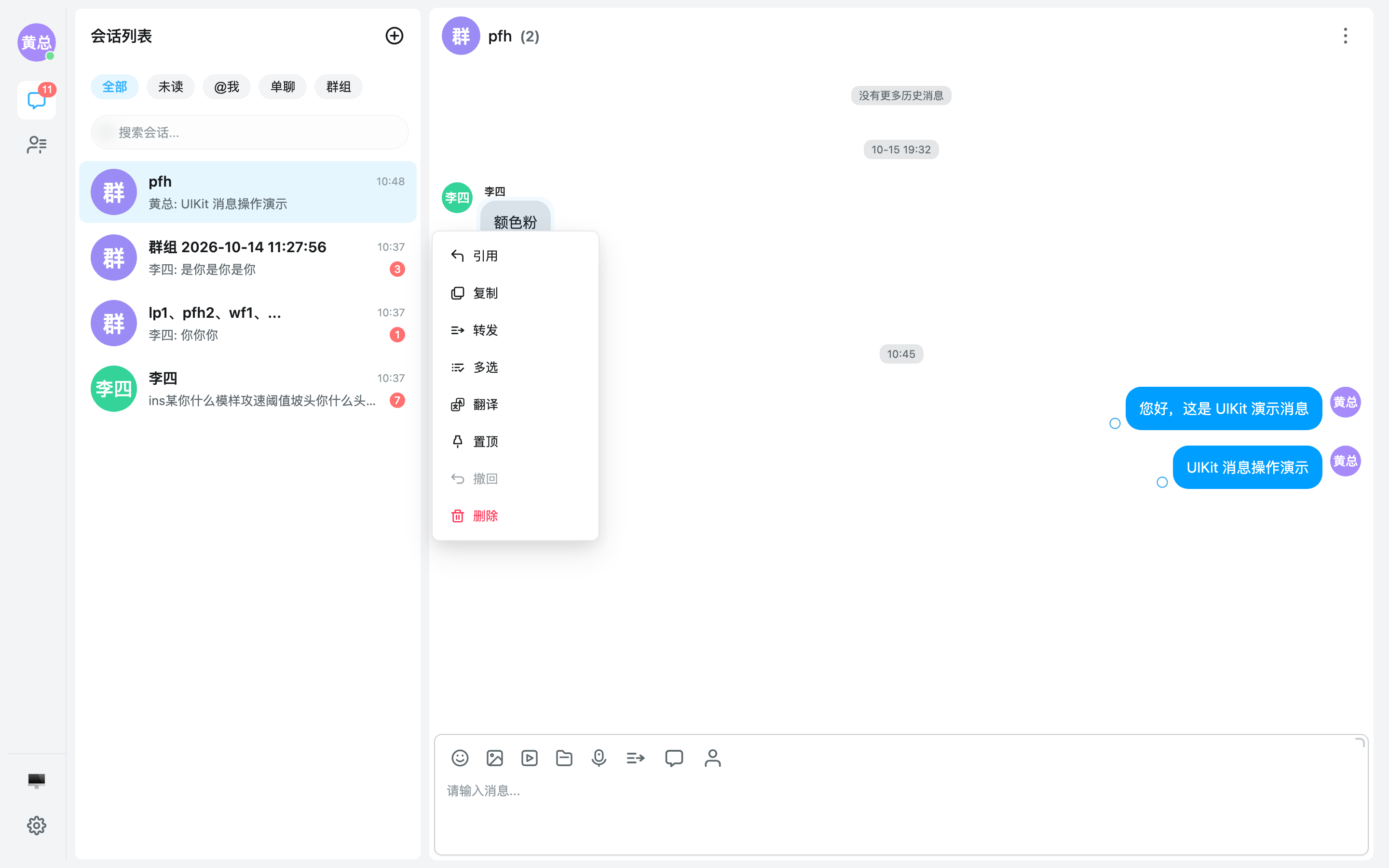
消息右键(PC)/ 长按(H5)菜单默认由内置动作集合(引用/复制/转发/多选/翻译/置顶/撤回/编辑/删除等)按消息类型裁剪生成。通过 #message-action-menu 插槽可完全接管菜单内容——例如插入自定义主菜单项(举报/收藏/业务菜单)或整体改分组/顺序:
<template>
  <em-chat-container>
    <!-- actions:内置动作列表;select:触发内置动作(含关闭菜单);close:关闭菜单 -->
    <template #message-action-menu="{ message, actions, select, close }">
      <div class="my-action-menu">
        <button v-for="action in actions" :key="action.type" @click="select(action.type, action)">
          {{ action.label }}
        </button>
        <button @click="report(message)">举报</button>
      </div>
    </template>
  </em-chat-container>
</template>
select(actionType, action?):触发内置动作(内部自动关闭菜单并执行引用/转发/置顶等逻辑)close():关闭菜单- 插槽提供时,PC Popup 与 H5 ActionSheet 双端均接管;H5 端默认 actions 列表自动隐藏
H5 长按弹出的 ActionSheet 面板默认把高频操作(引用/复制/转发/下载)收拢为顶部图标网格区,其余操作保持整行列表;面板带 drag handle,可在半屏(50dvh)与展开(78dvh)两档间拖拽或轻点切换,展开后列表区纵向滚动。高频集合可通过
config.messageAction.gridActionTypes自定义(传[]关闭网格分区),PC 右键菜单不受网格分区影响。
弹窗接管
聊天页内置的名片、邀请、转发、搜索、多选栏等子界面均支持接管(默认内容 = 内置实现,不传插槽行为不变):
<template>
  <em-chat-container>
    <!-- 名片弹窗:点头像/右键头像时打开业务自己的资料卡 -->
    <template #user-card="{ show, userId, open, close }">
      <MyUserCard v-model:show="show" :user-id="userId" @send-message="onSend" />
    </template>
    <!-- 多选栏:自定义多选底部操作 -->
    <template #multi-select-bar="{ visible, selectedMessages, forwardOneByOne, delete, close }">
      <div v-if="visible" class="my-select-bar">
        <span>已选 {{ selectedMessages.length }} 条</span>
        <button @click="forwardOneByOne">转发</button>
        <button @click="delete(selectedMessages)">删除</button>
        <button @click="close">取消</button>
      </div>
    </template>
    <!-- 转发弹窗:open(messages, mode?) 必须传入消息数组 -->
    <template #forward="{ show, messages, mode, open, close }">
      <MyForwardModal v-if="show" :messages="messages" :mode="mode" @forward="open($event.messages, $event.mode); close()" @cancel="close" />
    </template>
  </em-chat-container>
</template>
入群邀请弹窗独立使用 EmInviteMemberModal
#invite-member 插槽的默认内容即内置的 EmInviteMemberModal(已导出)。若需在容器外自行触发邀请(如群管理页),可独立引用:
<script setup lang="ts">
import { ref } from 'vue'
import { EmInviteMemberModal, useGroup } from '@easemob-community/uikit-im'

const show = ref(false)
const groupId = 'your-group-id'
const { inviteUsersToGroup } = useGroup()

async function onInvited(userIds: string[]) {
  await inviteUsersToGroup(groupId, userIds)
  show.value = false
}
</script>

<template>
  <EmInviteMemberModal v-model:show="show" :group-id="groupId" :existing-member-ids="[]" @invited="onInvited" />
</template>
InviteMemberModal API
Props
| 属性 | 类型 | 默认值 | 说明 |
|---|---|---|---|
| show | boolean | — | — |
| groupId | string | — | — |
| existingMemberIds | string[] | — | 已加入群的用户 ID 列表,用于禁用 |
Events
| 事件名 | 参数 | 说明 |
|---|---|---|
update:show | value: boolean | — |
invited | userIds: string[] | — |
invited在确认邀请时触发(负载userIds: string[]),实际入群调用由业务侧完成(如useGroup().inviteUsersToGroup)。
抽屉展示模式
通过 config.drawer 控制聊天信息抽屉的展示方式:
<EmChatContainer :config="{ drawer: { mode: 'push', width: 320 } }" />| 配置项 | 类型 | 默认值 | 说明 |
|---|---|---|---|
drawer.mode | 'overlay' | 'push' | 'push' | push 占位挤压聊天区,抽屉为与聊天区平级的独立平面区域(带动画);overlay 完全遮挡聊天区 |
drawer.width | number | 320 | 抽屉宽度(px),两种模式均生效 |
说明:
push模式下抽屉圆角跟随--uikit-components-radius(与 ChatContainer 边角一致),与主区间隔--uikit-container-gap透出宿主底色;抽屉整页背景与聊天容器统一为--uikit-chat-bg(header/body/各 section 均拉平,无分层色块);此模式无遮罩、点击外部不关闭,offsetTop语义失效(抽屉全高)。- 移动端(viewport < 768px)两种模式一律回落为满铺全屏(盖住 header、圆角归零、返回箭头替代关闭按钮),呈独立页面观感。
- 自绘壳
EmChatDrawer同样支持mode/fullscreenprops(见下方抽屉接管)。
抽屉接管
EmChatContainer / EmChat 提供三种抽屉接管能力,满足从「整体替换」到「局部定制」的不同需求。
1. 整块接管 #drawer
完全替换默认的聊天信息抽屉,自己控制开合与内容。常用于需要自绘资料卡/业务信息的场景。
<script setup lang="ts">
import { EmChatContainer, EmChatDrawer } from '@easemob-community/uikit-im'
</script>

<template>
  <EmChatContainer>
    <template #drawer="{ conversation, isGroup, show, close, offsetTop }">
      <EmChatDrawer :show="show" :overlay="false" :offset-top="offsetTop" @update:show="close">
        <div style="padding: 16px;">
          <h3>{{ conversation?.name }}</h3>
          <p>{{ isGroup ? '群聊' : '单聊' }} ID: {{ conversation?.id }}</p>
          <button @click="close">
            关闭
          </button>
        </div>
      </EmChatDrawer>
    </template>
  </EmChatContainer>
</template>
作用域:
| 属性 | 类型 | 说明 |
|---|---|---|
conversation | UiConversation | null | undefined | 当前会话 |
isGroup | boolean | 是否群聊 |
show | boolean | 抽屉是否打开 |
open | () => void | 打开抽屉 |
close | () => void | 关闭抽屉 |
offsetTop | number | 抽屉顶部偏移(header 实际高度,px;push/全屏模式忽略) |
mode | 'overlay' | 'push' | 抽屉展示模式(来自 config.drawer.mode) |
fullscreen | boolean | 是否全屏模式(移动端窄屏自动为 true) |
2. 部分接管 drawer-*
只重写抽屉内单个区块(如成员列表、群管理、footer),其余保持默认。
<EmChatContainer>
  <template #drawer-footer="{ conversation, isGroup, close }">
    <div style="padding: 16px;">
      <button @click="close">返回聊天</button>
    </div>
  </template>
</EmChatContainer>
可用 section 插槽:
| 插槽名 | 覆盖区块 | 显示条件 |
|---|---|---|
drawer-header | 标题栏(返回/关闭) | 一级页(非成员列表等二级页) |
drawer-members | 群成员九宫格 + 查看全部 | 仅群聊 |
drawer-settings | 消息搜索/免打扰/置顶/群文件等设置行 | 恒显示 |
drawer-actions | 通用操作接管位(默认无内容;群聊清空/删除已移至 footer 胶囊按钮组) | 恒显示 |
drawer-member-detail | 群成员列表二级页 | 二级页打开时 |
drawer-footer | 清空聊天记录/删除会话(单群一致,胶囊按钮组) | 一级页 |
说明:2.2.0 曾声明的
drawer-profile/drawer-remark/drawer-announcement/drawer-admin-actions/drawer-management区块已合并进默认 UI(群资料卡、公告、群主/管理员操作、群管理入口均不再单独暴露插槽),实际可接管区块以上表为准。
Section 插槽统一作用域:
| 属性 | 类型 | 说明 |
|---|---|---|
conversation | UiConversation | null | undefined | 当前会话 |
isGroup | boolean | 是否群聊 |
groupId | string | 群 ID(非群聊时为空字符串) |
group | UiGroup | undefined | 当前群信息 |
members | UiGroupMember[] | 群成员列表 |
memberCount | number | 群成员数 |
currentUserId | string | 当前登录用户 ID |
isOwner | boolean | 当前用户是否为群主 |
isAdmin | boolean | 当前用户是否为管理员 |
canAddMember | boolean | 当前用户是否可添加成员 |
loadingGroup | boolean | 群信息加载中 |
activePage | 'members' | 'member-search' | 'files' | null | 当前激活的二级页(null 为一级页) |
closeMemberList | () => void | 关闭当前二级页(返回一级页) |
close | () => void | 关闭抽屉 |
3. 自绘壳 EmChatDrawer
若只想使用通用抽屉壳(overlay / 偏移 / header/body/footer 插槽),可直接引入 EmChatDrawer:
<script setup lang="ts">
import { EmChatDrawer } from '@easemob-community/uikit-im'
</script>

<template>
  <EmChatDrawer :show="true" :overlay="true" :width="360" :offset-top="56">
    <template #header>
      自定义标题
    </template>
    <div>自定义内容</div>
    <template #footer>
      自定义底部
    </template>
  </EmChatDrawer>
</template>
注意:section 插槽被接管后,对应内置交互不再触发(如接管
drawer-members后,成员事件需由用户自行处理)。
4. 独立使用 EmChatInfoDrawer
不需要接管容器插槽、想在自己的布局里直接挂载完整聊天信息抽屉时,可单独引入 EmChatInfoDrawer(依赖 EmUIKitProvider 上下文,会话 / 群 / 用户资料数据均走 store):
<script setup lang="ts">
import { ref } from 'vue'
import { EmChatInfoDrawer, useConversation } from '@easemob-community/uikit-im'

const show = ref(false)
const { currentConversation } = useConversation()
</script>

<template>
  <EmChatInfoDrawer
    v-model:show="show"
    :conversation="currentConversation"
    :is-group="currentConversation?.type === 'groupChat'"
    mode="overlay"
    :width="360"
    @leave-group="onLeaveGroup"
  />
</template>Props(ChatInfoDrawerProps 全量):
ChatInfoDrawer API
Props
| 属性 | 类型 | 默认值 | 说明 |
|---|---|---|---|
| show | boolean | — | — |
| conversation | Conversation | null | — | — |
| isGroup | boolean | — | — |
| offsetTop | string | number | — | — |
| groupManagementDisplayMode | 'drawer' | 'modal' | 'drawer' | 群管理二级页面展示方式:drawer(抽屉)或 modal(居中弹窗)。 |
| allowChat | 'all' | 'contact' | 'none' | 'all' | 是否允许对成员发起单聊:'all' 所有人,'contact' 仅联系人,'none' 不允许 |
| showMuteAll | boolean | true | 是否展示全员禁言开关 |
| showMuteList | boolean | true | 是否展示禁言列表入口 |
| showBlocklist | boolean | true | 是否展示黑名单入口 |
| showAllowlist | boolean | false | 是否展示白名单入口 |
| showSharedFiles | boolean | true | 是否展示共享文件入口 |
| showJoinRequests | boolean | false | 是否展示入群申请入口 |
| mode | 'overlay' | 'push' | 'push' | 抽屉展示模式:push 占位挤压聊天区(默认)/ overlay 完全遮挡 |
| closeOnClickOutside | boolean | true | 点击抽屉外部(聊天区 / 空白处)是否关闭,默认 true;透传 ChatDrawer 的 closeOnClickOutside,仅 push 模式生效 |
| fullscreen | boolean | false | 全屏模式(移动端独立页面):满铺聊天容器、圆角归零,header 主档显示返回箭头; 移动端下经 ChatDrawer 升级为视口级 fixed 全屏层(盖住宿主页面 header) |
| width | number | — | 抽屉宽度(px),默认 320;全屏模式忽略 |
| showMessageSearch | boolean | — | 是否展示「消息搜索」入口行(由宿主按 messageList.search 配置下发) |
| avatarClickViewProfile | boolean | true | 预览区点击头像是否打开用户名片(单聊对方头像 / 群聊成员宫格头像),默认 true; 由宿主按 ChatConfig.drawer.avatarClickViewProfile 下发;名片弹层由宿主经 view-profile 事件接管 |
Events
| 事件名 | 参数 | 说明 |
|---|---|---|
update:show | value: boolean | — |
leave-group | groupId: string | — |
destroy-group | groupId: string | — |
clear-history | payload: { id: string, type: ConversationTypeValue, deleteConversation?: boolean, deleteRoaming?: boolean } | — |
add-member | groupId: string | — |
group-operation | payload: { type: string, groupId: string, userId?: string } | — |
chat-member | member: UiGroupMember | — |
remove-member | member: UiGroupMember | — |
set-admin | member: UiGroupMember | — |
remove-admin | member: UiGroupMember | — |
block-changed | userId: string, blocked: boolean | 单聊拉黑/取消拉黑状态变更。 默认 UI 已按新设计稿移除拉黑入口;保留事件声明供 drawer-actions 等插槽接管时触发。 |
search-message | — | 打开消息搜索(由宿主 chat 容器接管搜索弹窗) |
create-group | userId: string | 单聊「添加」:以对方为初始成员发起群聊 |
view-profile | userId: string, anchor: HTMLElement | 预览区头像点击:查看用户名片(由宿主 chat 容器接管名片弹窗,anchor 为头像所在元素) |
Slots
| 插槽名 | 说明 |
|---|---|
drawer-header | — |
drawer-members | — |
drawer-settings | — |
drawer-actions | — |
drawer-member-detail | — |
drawer-footer | — |
七项 deprecated props:
groupManagementDisplayMode/showMuteAll/showMuteList/showBlocklist/showAllowlist/showSharedFiles/showJoinRequests已废弃(源码标注@deprecated),默认 UI 不再消费,仅为兼容保留。
Events 说明: clear-history(清空聊天记录,含删除会话漫游选项)/ block-changed(单聊拉黑状态变更,默认 UI 无入口,供 drawer-actions 接管使用)/ search-message(打开消息搜索,需宿主接管搜索弹窗);其余成员操作类(chat-member / remove-member / set-admin / remove-admin)与群管理类(leave-group / destroy-group / add-member / group-operation / create-group)事件负载见上表。
群已读回执
通过 config.groupReadReceipt 启用(enabled 默认 false,maxGroupSize 默认 200,超过该人数的群不发已读回执)。启用后群聊消息支持查看已读 / 未读成员,点击已读入口时弹出内置的已读详情弹窗。
如需在业务页面独立展示已读详情(如自建的消息统计页),可直接引用已导出的 EmGroupReadReceiptModal:
<script setup lang="ts">
import { ref } from 'vue'
import { EmGroupReadReceiptModal } from '@easemob-community/uikit-im'

const show = ref(false)
const readList = ref(['userA', 'userB'])
const unreadList = ref(['userC'])
</script>

<template>
  <EmGroupReadReceiptModal v-model:show="show" :read-list="readList" :unread-list="unreadList" />
</template>
GroupReadReceiptModal API
Props
| 属性 | 类型 | 默认值 | 说明 |
|---|---|---|---|
| show | boolean | — | — |
| readList | string[] | — | — |
| unreadList | string[] | — | — |
Events
| 事件名 | 参数 | 说明 |
|---|---|---|
update:show | value: boolean | — |
流式消息(AI)
内核已内置流式消息(Stream Message)的数据链路与纯文本流式状态,开箱即用:
onStreamMessage分片按msgServerId合并到同一条气泡,body.content以fullText幂等覆盖,不产生新气泡;customType='text'(或缺省):传输中尾部打字机光标、完成态收敛、异常态提示;- 流式内容增长时消息列表自动跟随滚动(仅位于底部时)。
customType='markdown' 等富格式流式内容由插件通过 #message-txt 插槽接管渲染(内核无感,不引入 markdown 依赖):
<em-chat-container :config="chatConfig">
  <template #message-txt="{ message }">
    <MyMarkdownMessage :message="message" />
  </template>
</em-chat-container>
完整的插件气泡参考实现与 AI 接入三模式(Mock / 直连 / 业务代理)见 AI 流式消息。
实例方法
setText(text):设置输入框内容getText():读取输入框当前内容
进阶
- 消息列表为虚拟滚动,长会话列表性能有保障;切换会话自动重置滚动位置与多选状态。
- 引用、翻译、语音转文字、消息定位(搜索跳转)等能力由
useChat()等组合式函数暴露,可在业务代码中直接调用。 - 想直观体验
config.messageList各项视觉配置(布局、头像、时间戳、气泡形状、间距、消息状态)的组合效果,可前往消息列表查看单条气泡能力演练场。
插件机制
EmChatContainer 提供了插槽 + useChatPlugin() 组合的插件体系,允许开发者在聊天输入区、消息列表区中注入自定义 UI 与交互逻辑,扩展出新的消息类型或功能面板。Demo 工程中的「快捷回复面板」与「用户名片发送」就是基于这套体系实现的。
扩展点概览
┌─ EmChatContainer ────────────────────────────────────────────────┐
│  ┌─ header 区域 ──────────────────────────────────────────────┐  │
│  │  #header / #header-avatar / #header-title / #header-extra  │  │
│  └────────────────────────────────────────────────────────────┘  │
│  ┌─ 消息列表 ─────────────────────────────────────────────────┐  │
│  │  #message-*(类型级插槽,如 #message-custom)               │  │
│  └────────────────────────────────────────────────────────────┘  │
│  ┌─ 消息输入区 ───────────────────────────────────────────────┐  │
│  │  #toolbar-extra ─→ 扩展工具栏按钮(如快捷回复、名片入口)   │  │
│  │  #input-panel   ─→ 自定义面板(如快捷回复面板)             │  │
│  └────────────────────────────────────────────────────────────┘  │
└──────────────────────────────────────────────────────────────────┘
useChatPlugin()
useChatPlugin() 是插件组件与 UIKit 聊天的桥梁。在 EmChatContainer 的插槽内调用它即可获取当前会话上下文、消息发送能力与输入框操作方法。
| 属性 / 方法 | 类型 | 说明 |
|---|---|---|
currentConversation | ComputedRef<UiConversation | null> | 当前正在聊天的会话对象 |
currentUserId | ComputedRef<string | null> | 当前登录用户 ID |
send.sendTextMessage | (text, ext?) => Promise<any> | 发送文本消息 |
send.sendCustomMessage | (event, params?, ext?) => Promise<any> | 发送自定义消息(核心扩展能力) |
send.sendImageMessage | (data: File | string, ext?) => Promise<any> | 发送图片消息 |
send.sendFileMessage | (file: File, ext?) => Promise<any> | 发送文件消息 |
send.sendAudioMessage | (file, duration, ext?) => Promise<any> | 发送语音消息 |
send.sendVideoMessage | (file, duration, ext?) => Promise<any> | 发送视频消息 |
send.sendLocationMessage | (body, ext?) => Promise<any> | 发送位置消息 |
getUserDisplayName | (userId: string) => string | 解析用户展示名称 |
getUserAvatar | (userId: string) => string | undefined | 获取用户头像 URL |
setText | (text: string) => void | 设置输入框文本 |
getText | () => string | 读取输入框当前文本 |
focus | () => void | 聚焦输入框 |
import { useChatPlugin } from '@easemob-community/uikit-im'

const { currentConversation, send, setText } = useChatPlugin()
插槽 API
#toolbar-extra
在输入框工具栏中追加自定义按钮。适用于快捷回复入口、名片发送入口等触发器。
插槽 Props:
| 属性 | 类型 | 说明 |
|---|---|---|
togglePanel | () => void | 切换自定义面板(#input-panel)的展开/收起 |
showPanel | boolean | 当前面板是否展开 |
closePanel | () => void | 关闭自定义面板 |
#input-panel
在输入框下方渲染自定义面板。面板由 #toolbar-extra 中的按钮触发(调用 togglePanel),也可通过组件内部逻辑控制。
插槽 Props:
| 属性 | 类型 | 说明 |
|---|---|---|
showPanel | boolean | 面板是否可见 |
closePanel | () => void | 关闭面板 |
#message-custom
自定义消息类型的渲染映射。当消息列表中遇到 type === 'custom' 的消息时,UIKIT 会将渲染委托给此插槽,开发者可在此根据 body.event 将不同类型的自定义消息映射到不同的展示组件。
插槽 Props:
| 属性 | 类型 | 说明 |
|---|---|---|
message | UiMessage | 当前自定义消息对象(message.body 为 CustomMessageBody) |
完整示例:快捷回复面板
以下示例展示了如何利用 #toolbar-extra + #input-panel 实现一个客服常用的快捷回复面板。
Step 1 — 在 chat-container 上注册 slot:
<script setup lang="ts">
import { EmChatContainer } from '@easemob-community/uikit-im'
import DemoQuickReplyPanel from './demo-quick-reply-panel.vue'

const chatContainerRef = ref<InstanceType<typeof EmChatContainer>>()
</script>

<template>
  <EmChatContainer ref="chatContainerRef">
    <!-- 工具栏:追加快捷回复按钮 -->
    <template #toolbar-extra="{ togglePanel }">
      <button title="快捷回复" @click="togglePanel">
        <EmIcon name="chat/3lines_n_arrow" :size="22" />
      </button>
    </template>

    <!-- 面板:快捷回复内容 -->
    <template #input-panel="{ showPanel, closePanel }">
      <DemoQuickReplyPanel
        v-if="showPanel"
        @select="(text) => { chatContainerRef?.setText?.(text); closePanel() }"
      />
    </template>
  </EmChatContainer>
</template>
Step 2 — 实现面板组件(demo-quick-reply-panel.vue):
<script setup lang="ts">
import { useChatPlugin } from '@easemob-community/uikit-im'

const emit = defineEmits<{ (e: 'select', text: string): void }>()

// 通过 useChatPlugin 获取会话信息
const { currentConversation } = useChatPlugin()

const quickReplies = [
  { label: '您好,请问有什么可以帮您?', text: '您好,请问有什么可以帮您?' },
  { label: '感谢您的咨询,祝您生活愉快!', text: '感谢您的咨询,祝您生活愉快!' },
]

function onSelect(item) {
  emit('select', item.text)
}
</script>

<template>
  <div class="quick-reply-panel">
    <div v-if="!currentConversation" class="empty">
      请先选择一个会话
    </div>
    <div v-else class="reply-list">
      <button
        v-for="item in quickReplies"
        :key="item.label"
        class="reply-item"
        @click="onSelect(item)"
      >
        {{ item.label }}
      </button>
    </div>
  </div>
</template>
完整示例:用户名片消息
名片是自定义消息类型的典型场景 —— 需要同时定义「发送端」(如何选名片并发送)和「展示端」(如何渲染名片气泡)。
Step 1 — 在 chat-container 上注册 slot:
<template>
  <EmChatContainer>
    <!-- 工具栏:追加名片发送按钮 -->
    <template #toolbar-extra>
      <button title="发送名片" @click="showCardPicker = true">
        <EmIcon name="people/person_single" :size="22" />
      </button>
    </template>

    <!-- 展示:自定义消息气泡 -->
    <template #message-custom="{ message }">
      <DemoCardMessage
        v-if="message.body?.event === 'send_card'"
        :message="message"
        @card-click="(uid) => showCardModal(uid)"
      />
    </template>
  </EmChatContainer>
</template>
Step 2 — 发送名片(在工具栏按钮的点击回调中):
import { useChatPlugin } from '@easemob-community/uikit-im'

const { send } = useChatPlugin()

function sendCard(userId: string) {
  send.sendCustomMessage('send_card', {
    uid: userId,
    nickname: '张三',
    avatar: 'https://...',
  })
}
Step 3 — 渲染名片气泡(DemoCardMessage.vue):
<script setup lang="ts">
import { useUserInfo } from '@easemob-community/uikit-im'
import type { CustomMessageBody, UiMessage } from '@easemob-community/uikit-im'

const props = defineProps<{ message: UiMessage }>()
const emit = defineEmits<{ (e: 'card-click', userId: string): void }>()

const body = computed(() => props.message.body as CustomMessageBody)
const uid = computed(() => body.value.params?.uid || '')

// 用 useUserInfo 拉取用户资料
const { displayName, avatarUrl } = useUserInfo(uid)
</script>

<template>
  <div class="card-bubble" @click="emit('card-click', uid)">
    <EmAvatar :src="avatarUrl" :name="displayName" :size="40" />
    <span>{{ displayName || uid }}</span>
    <div class="footer">
      名片
    </div>
  </div>
</template>
消息类型扩展原理
- 业务代码通过
send.sendCustomMessage(event, params, ext)发送一条type: 'custom'的消息,其中event为自定义类型标识(如'send_card'、'order_share')。 - 消息列表渲染到该消息时,匹配
#message-custom插槽,将UiMessage传入。 - 业务组件在插槽内根据
message.body.event分发到不同的渲染组件(v-if="event === 'send_card'")。
通过这套机制,开发者可以在不修改 UIKIT 源码的前提下,为聊天页面扩展任意自定义消息类型与交互面板。
参考 Demo:
apps/demo/src/components/demo-quick-reply-panel.vue、apps/demo/src/components/demo-card-message.vue、apps/demo/src/components/demo-card-picker-modal.vue。